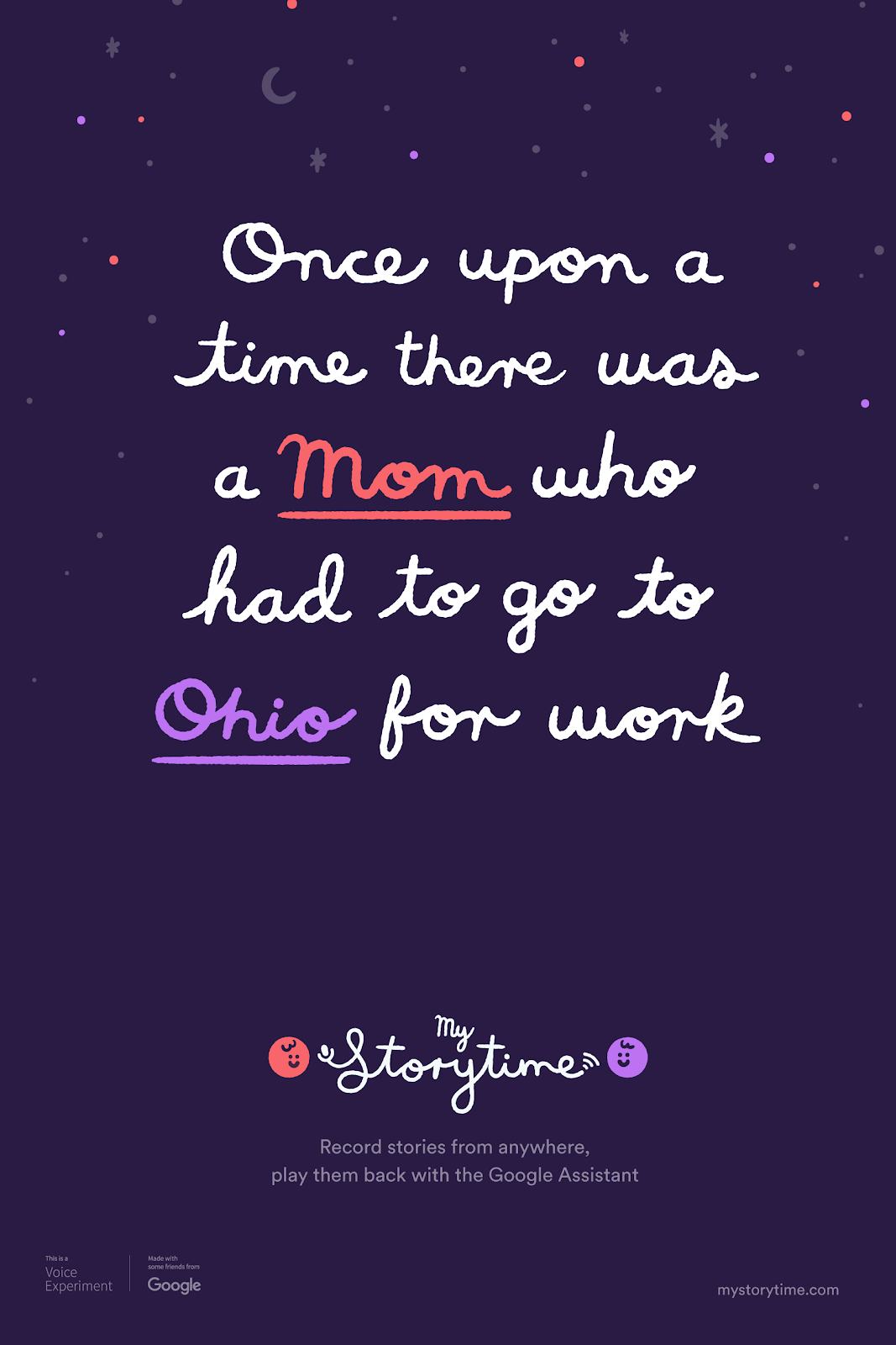
Giving military families the ability to hear bedtime stories from their parent as they serve overseas.
AWARDS
Webby Award
PRESS
As seen in ProductHunt, The Verge, VentureBeat, CNET, VoiceBot.ai, etc.
Role
UX + Design Direction
Studio
Google Creative Lab
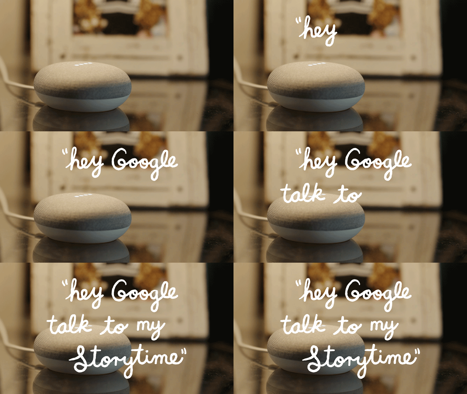
While at the Google Creative Lab we partnered with Instrument and the USO (the Army) to build My Storytime. This app allows parents to record bedtime stories for their kids wherever they are in the world and it played back through the Google Home.
Inspired by a military family using Google Drive to send their children recordings of bedtime stories, Google partnered with the Bob Hope Foundation to build a custom Google Assistant action that could now allow anybody to replicate the “hack” that Oliver family went through using Google Home. The product was built together with our development partner Instrument in Portland, Oregon and included a shoot with the Oliver family who reviewed the product together with the kids. It was also featured in the experiments tent at the Google I/O conference and was definitely one of the most heartwarming projects I ever had the pleasure of working on!
Phase One:
Strategy & Vision
Defining the UX to allow users to pre-record stories for their kids.
01
Easy Peasy Onboarding
We want both the onboarding experience for listeners and those recording to be very easy to understand.
02
Fast to Record
Users get right into the interface when it comes to recording a story. UI is large and easy to understand.
03
Easy to Upload
As soon as a user is done recording a story, it’s uploaded and their family is notified via email.
04
Minimal Editing
Rather than getting too clunky with a hard-core editing interface, we kept it easy for families.
Phase Two:
Design & Sketch
Understanding the User
Personas
Main Pain Points
Accessibility
Requiring a work-around to access evening stories by currently using Google Drive
Time
Having the current experience being broken up into various segments, so there’s inconsistency
Organization
Not having a way to record segments, and having to rely on creating various folders to save stories
SKETCHING
Outlining the User Experience
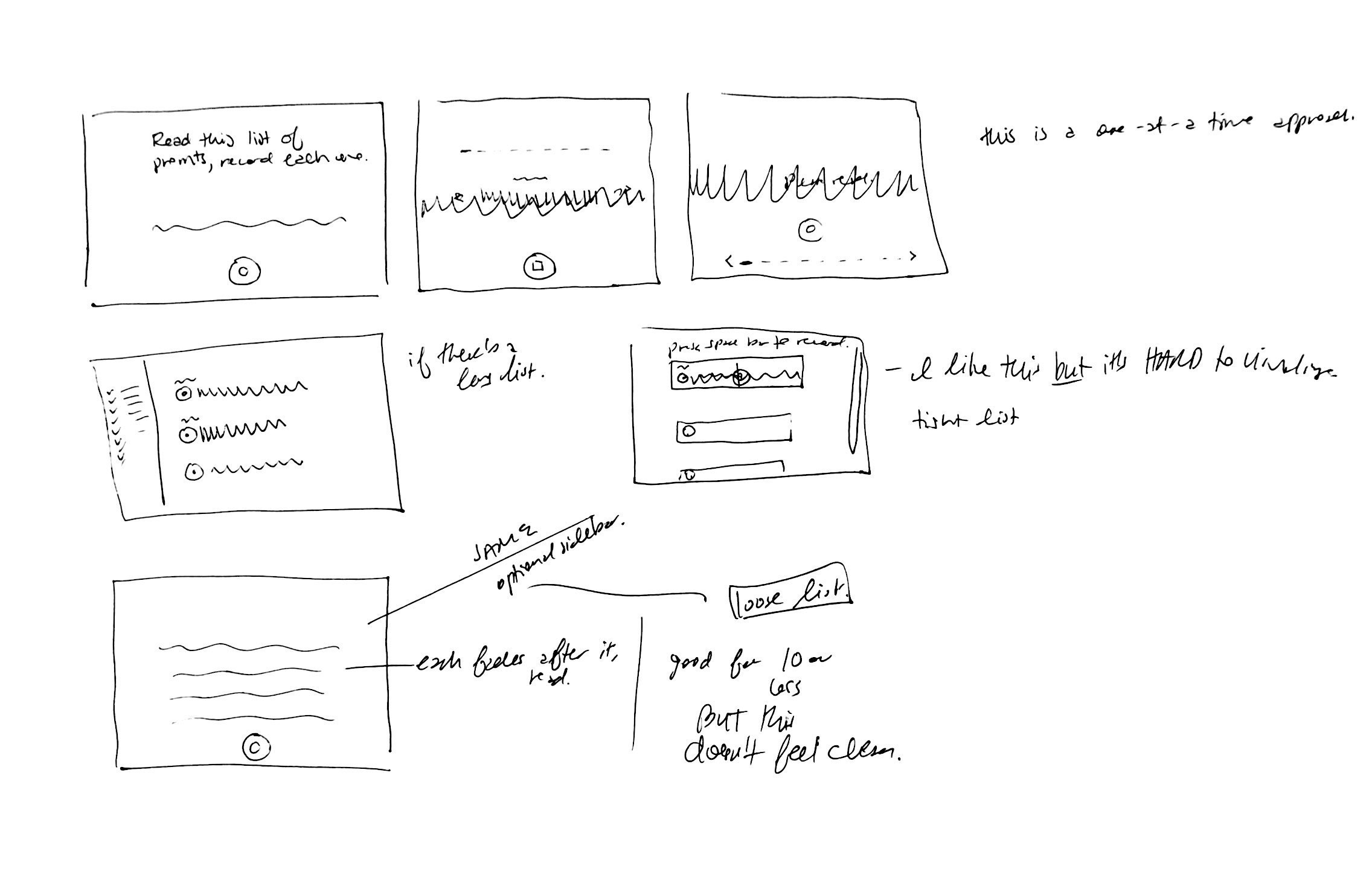
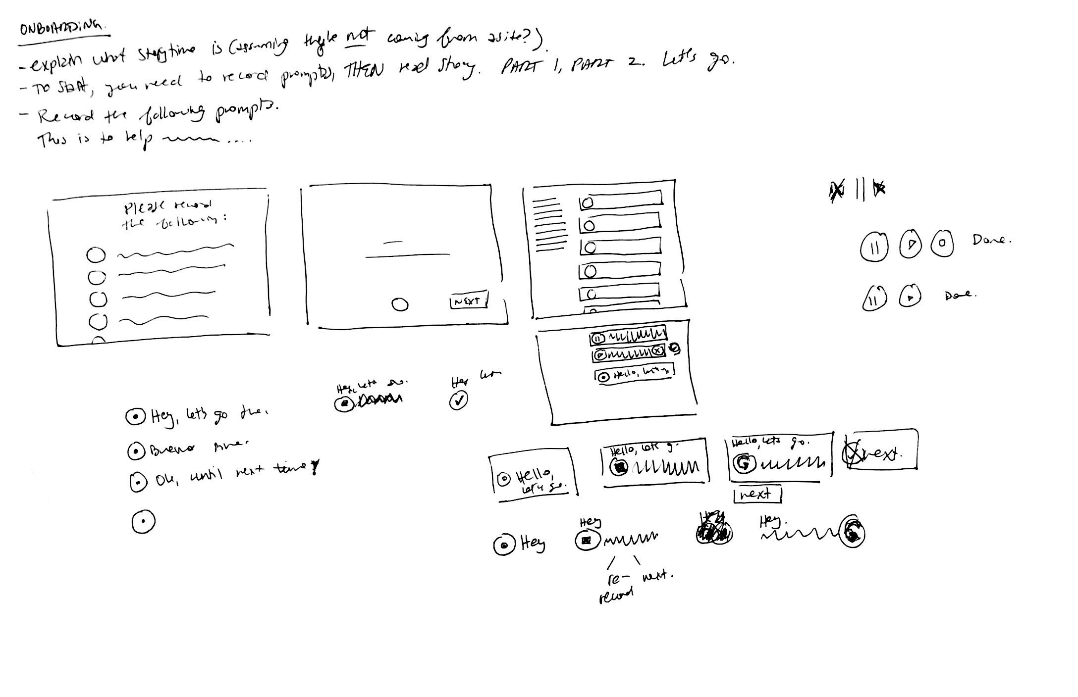
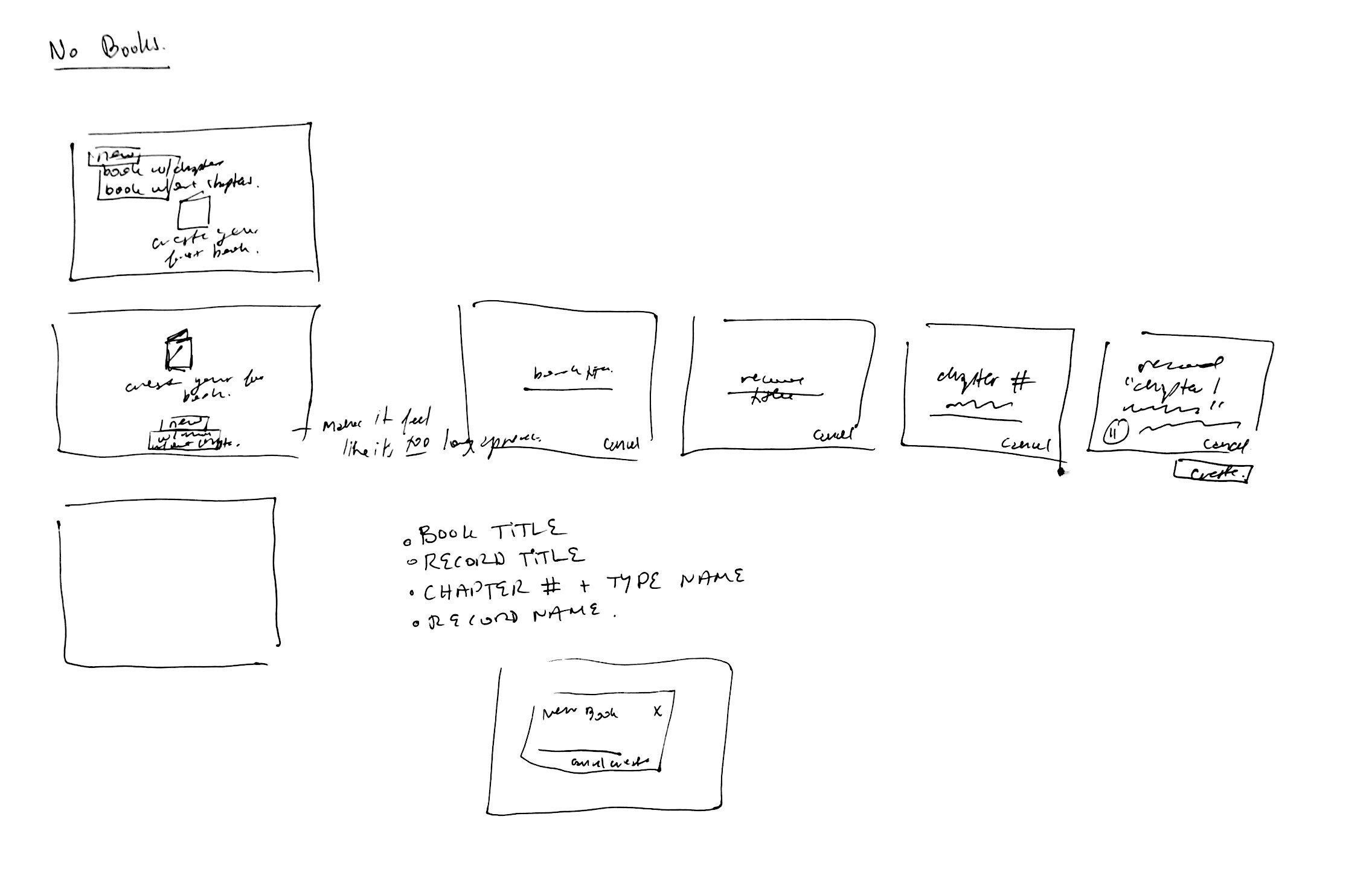
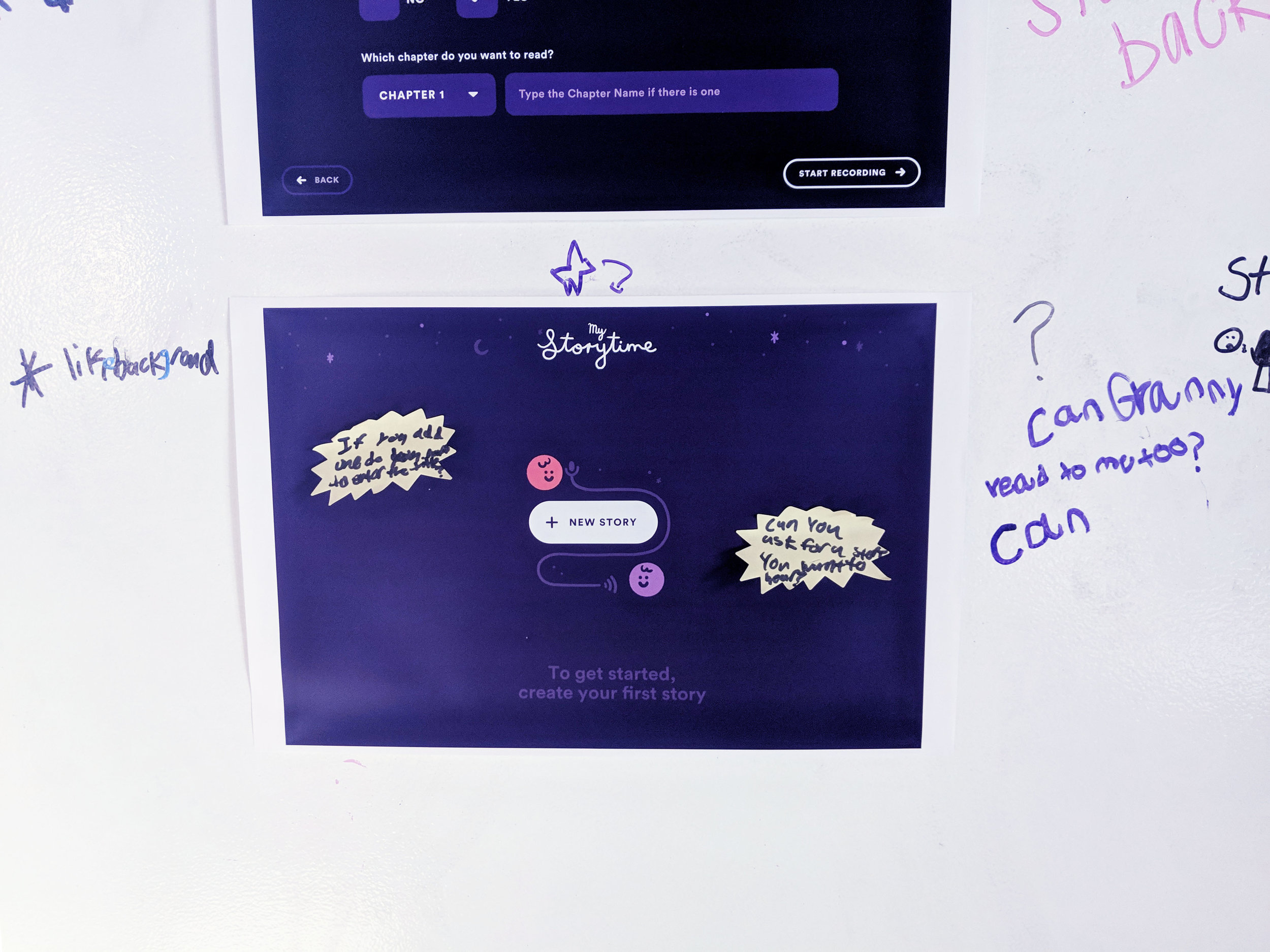
From quickly sketching out UI needed for record flows, to reverse-engineering replacing the assistant with a parent's voice, sketching was the quickest way to solve user challenges. Sketching out full flows was the first step before anything went into a computer. It also gave our team the flexibility we needed to think broadly.
“My daughters and I shared our own experiences and ideas in hopes that it would be useful to the more than 100,000 military parents who deploy every year—and the nearly 250,000 children who are back home. According to one organization, United Through Reading, that’s 40 million bedtime stories missed each year by military children. But storytime isn’t only important to military families. Grandparents who live states away, nurses and police officers who work the night shift, and anyone who travels for work can relate to the struggle of trying to make it home in time to read for bedtime. Because every bedtime story is, at its heart, a love story.” - The Oliver Family
Understanding the User
Empathy Mapping
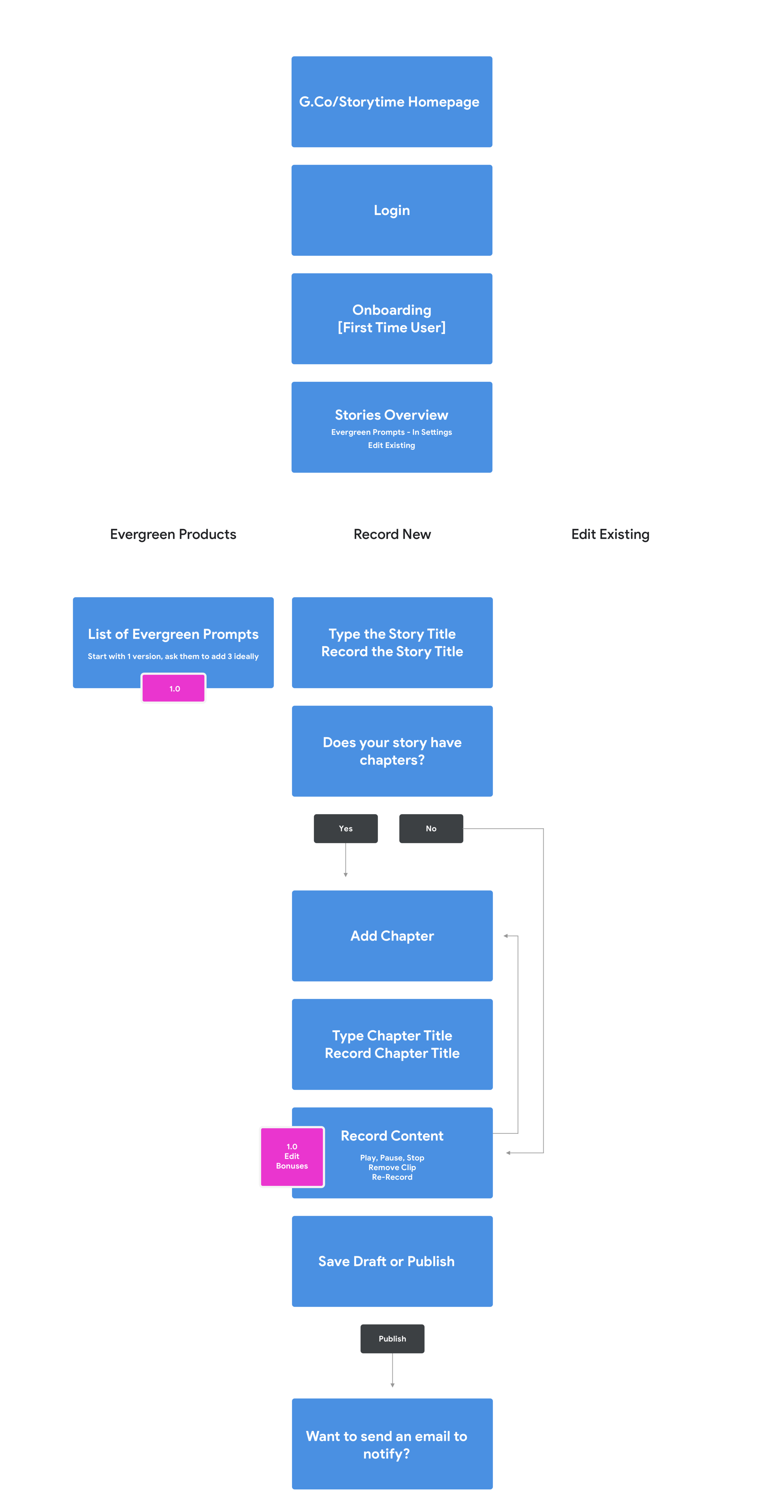
Flows - Web + Google Home
Web Sign-Up Flow - Recorder Only
Google Home - Voice Flow for Recorder + Listener
Setup Flow
To set up the device, there are two different flows:
a) The listener initiates the setup
b) Whoever is recording the story initiates the setup
This was an important distinction for the tech team, so our team designed the flow for how this should be developed.
UX Wireframes + Prototyped File
UX Clickthrough - Onboarding Process
UX Clickthrough - Recording
UX Clickthrough - Creating a New Story
UX Clickthrough - Stories Overview, Add Chapter
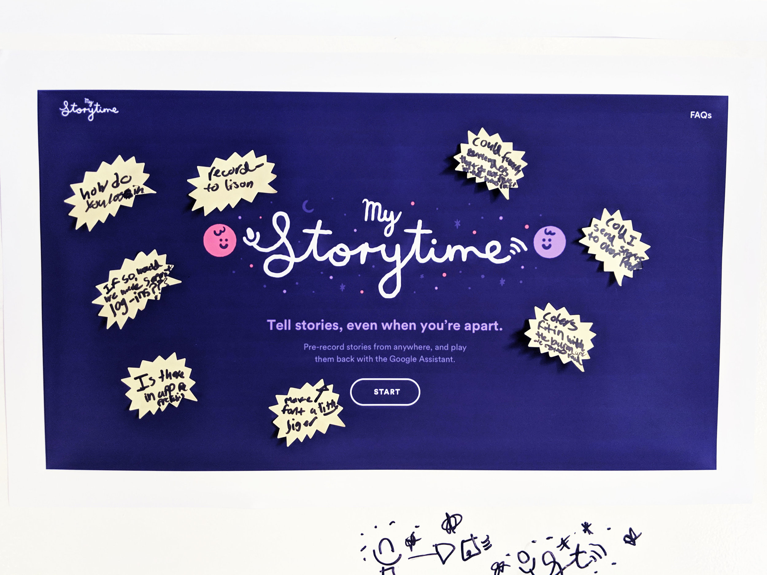
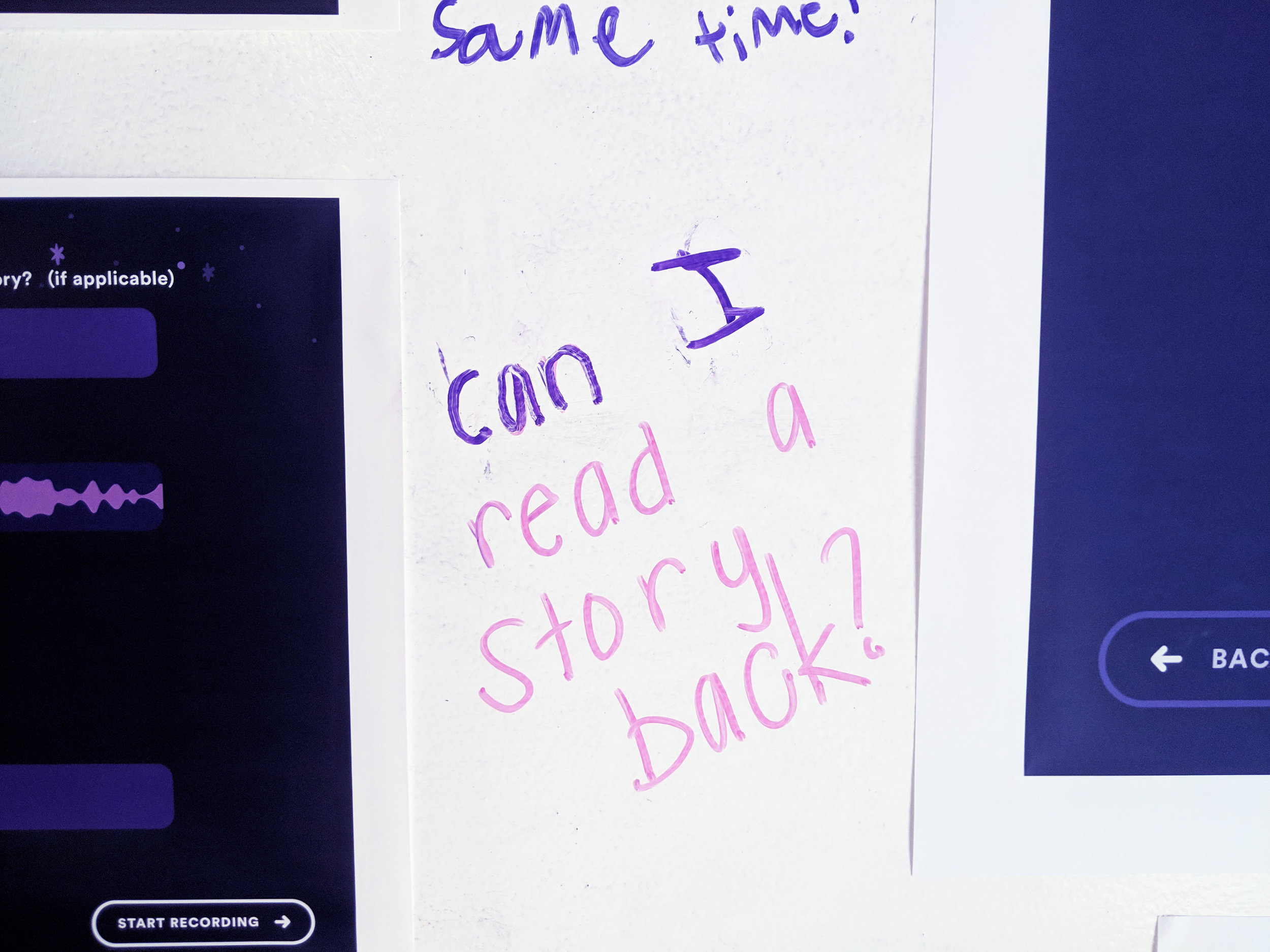
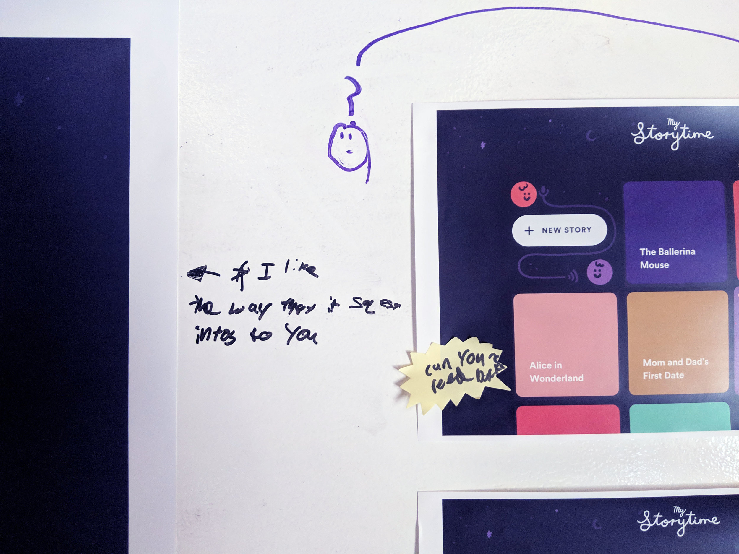
Visual Design + User testing
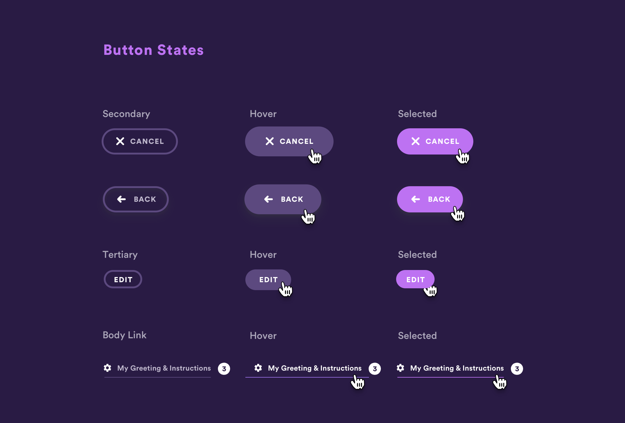
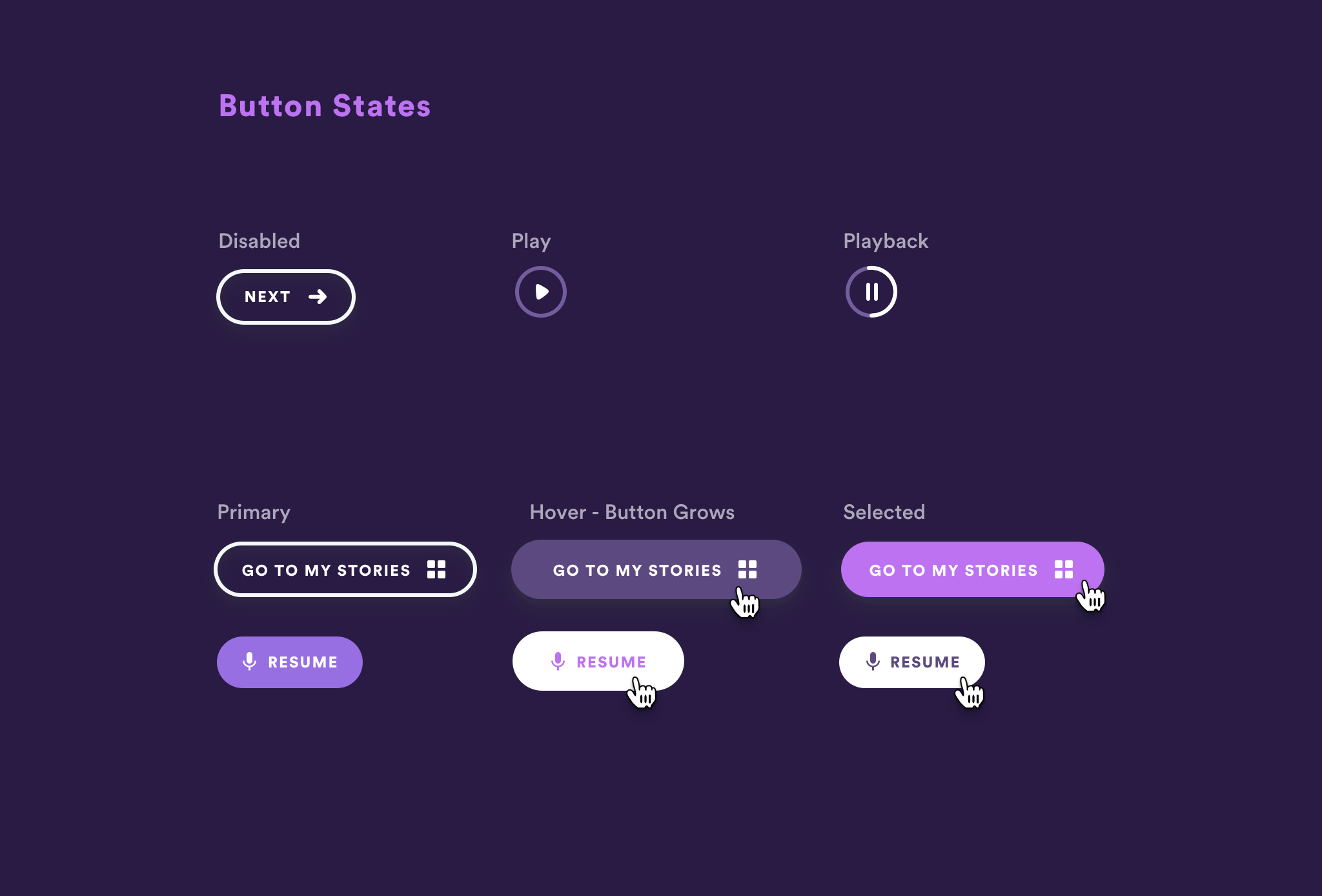
During this time, our team refined the visual design concepts and began testing.
We were inspired by the idea of a campfire, and darker recording booths.
So our visuals became darker, and we started to define this process.


