Reinventing how streaming services and standard cable TV can co-exist in one holistic platform.
Role
Design Lead
Studio
Fantasy Interactive
Google approached us to plan, build and ship an innovative new Fiber TV experience from scratch, requesting the service to be rolled out in various cities across the U.S. (Austin, Atlanta, Nashville, Kansas City and Raleigh).
We set our own requirements and collaborated with a lean executive team at Google to develop an entirely new experience for users leveraging their search capabilities. The end product was an elegant design system with thoroughly tested UX for a brand new kind of TV experience.
Phase One:
Strategy & Vision
Define UX that blends both live and streaming services.
01
Information Architecture
An overarching system for new and existing TV features.
02
Feature Definition
New and improved features and functionalities for a smarter and more curated TV experience.
03
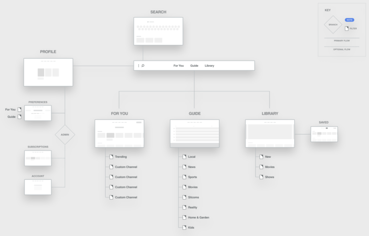
High-Level Sitemap
A navigation structure and hierarchy to tie it all together.
04
Research Readout
Informed insights from user and concept testing with potential and current customers.
Synthesizing User Research
Personalized & Catered
Users want personalized recommendations based on their individual interests, along with serendipitous discovery.
“I like that, trying hard to tailor to you…like the idea of a company saying ‘Hey, you’re an individual person. You’re different than the next person.’”
Simpler & Easier
Users want a TV experience that they don’t have to think about. People have their routines, give them a product that fits into them.
“Searching for my favorite show should be like brushing my teeth – I don’t want to have to think about it. Right now, its like tying my shoes – it’s not hard but I have to think about it.”
Voice Activation
A simpler and smarter search experience.
“I wish there was a voice, kind of like when you can say “Okay Google”, if I could say “Okay Spectrum”. I would rather voice it, typing is a pain.”
TV is Social
Word of mouth and social is still the primary source of content discovery. Users want to share shows and recommendations with their loved ones.
“If I could share some of the shows that I watch and post them to friends, that would be awesome.”
Clear & Unified Billing
A centralized account management and billing experience that is easy and transparent.
“But maybe there's one company they send you one bill. Everything’s lumped in so you only are paying one person versus a million different things.”
Phase Two:
Design & Prototype
Content Strategy
Define content framework and metadata strategy for different user behaviors across entire ecosystem.
A new but familiar brand voice for Google Fiber TV
Provide content & metadata strategy to enable faster decisions
Every content experience being tailored to the moment
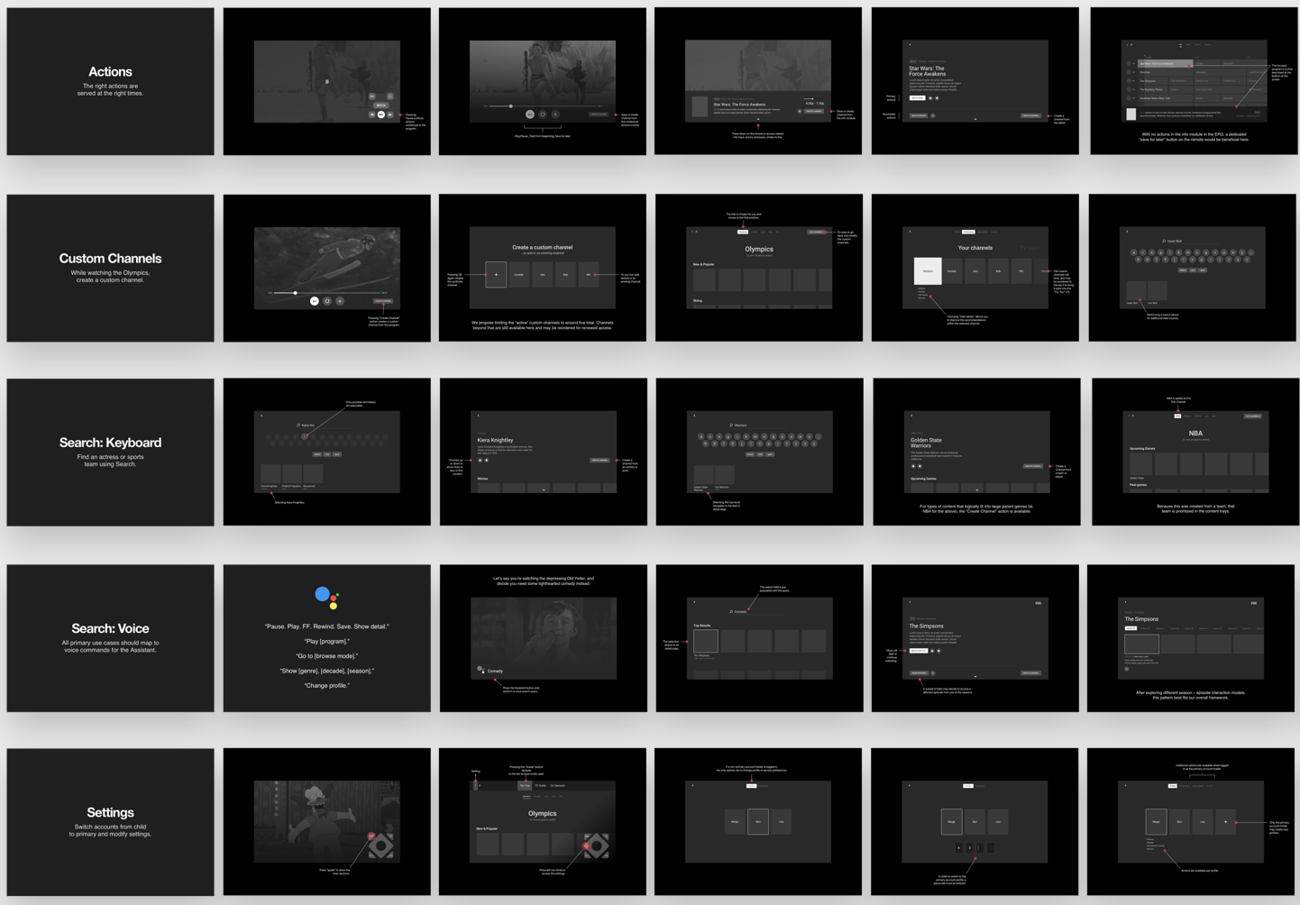
UX & Wire-Framing
Create a framework that enables users to find and watch content in the quickest way.
A flexible system of elements and interaction models
Keep it as flat as possible
Avoid “Netflix paralysis”
Design Principles
01
Content First Approach
People care about the content, not where its coming from. We want to show the content and hide all the noise that is less relevant.
02
Personalized & Curated
The TV watching experience should adapt to the person that is watching, not the other way around.
03
Faster in Every Way
The promise of Google Fiber. Everything should be fast, from connection speed to how quickly it takes to find something to watch
04
Simplicity in Experience
People are overwhelmed with choice. We want to minimize and provide a simple, clean way to get from point A to point B.
05
Transparent & Clear
We want to be transparent with billing but also everything in the experience to increase intuition, visual feedback and make it a joy to use.
06
Accessible Ecosystem
A flattened hierarchy to remove layers of complexity to get to the right content. The experience should feel clean, minimal and within the aesthetic of Google.
Visual Design
Global screens and elements that live throughout the experience.
Library
Your personal and highly personalized space for everything thats accessible to you right now.
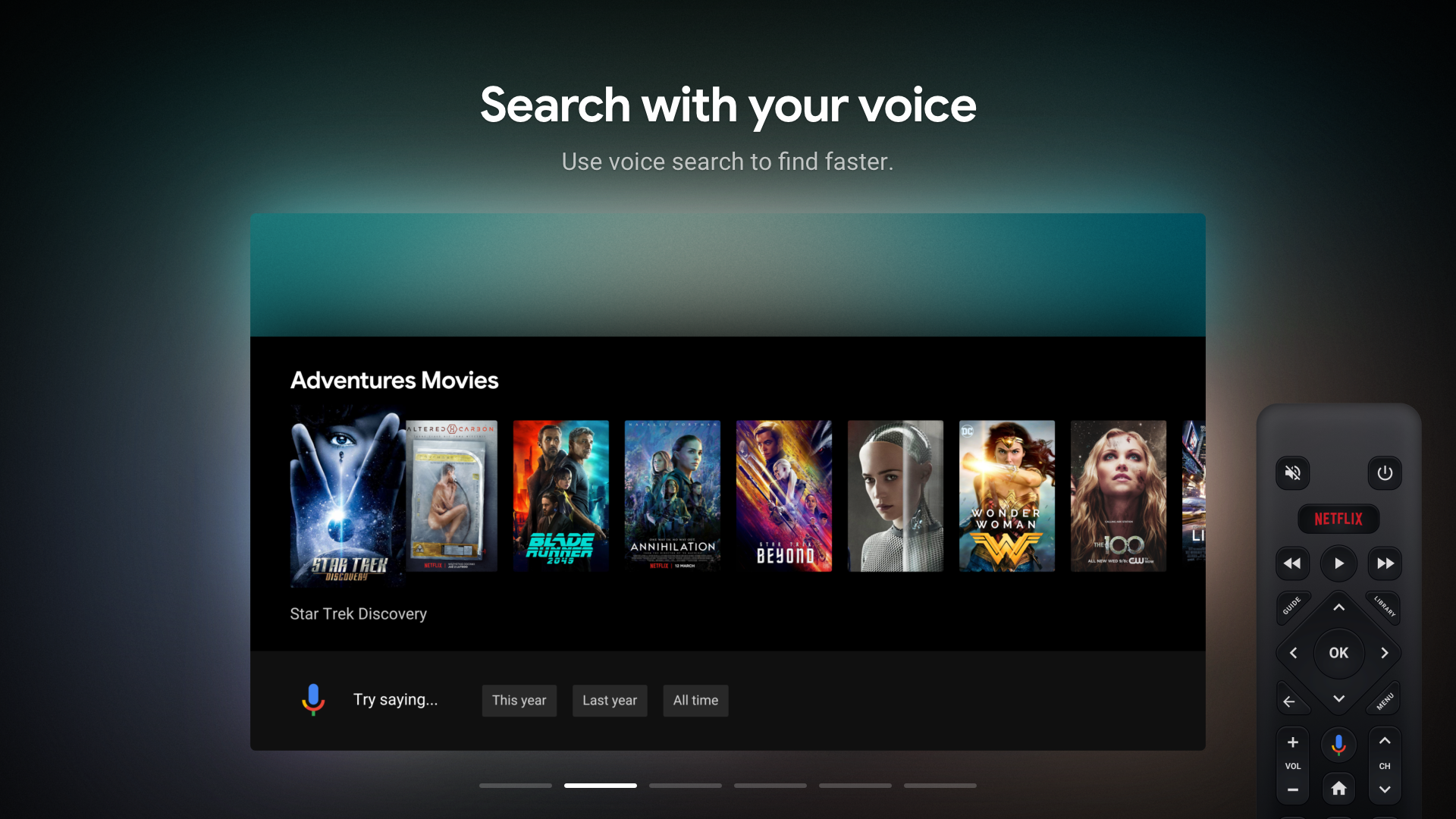
Search
Voice and keyboard enabled search from the worlds best search engine.
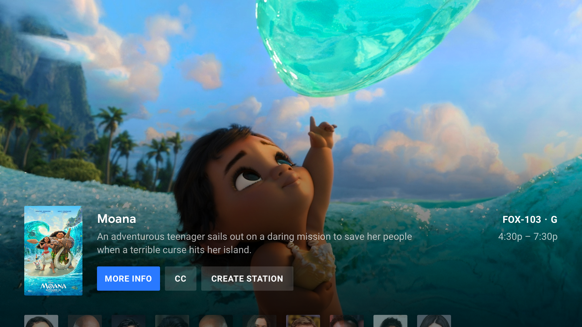
Guide
Your typical TV guide - a dedicated space for live programming, channel surfing and planning.
Phase Three:
Dev Support
Coded Handoff detailed design assets in the most seamless way possible.
Real Data Prototype
A functioning prototype that lives and breathes designs to remote control and user behavior. Uses real data with code.


